UX Mistakes Killing Conversions (Why They Happen and How to Fix Them)
- Feb 17
- 1 min read
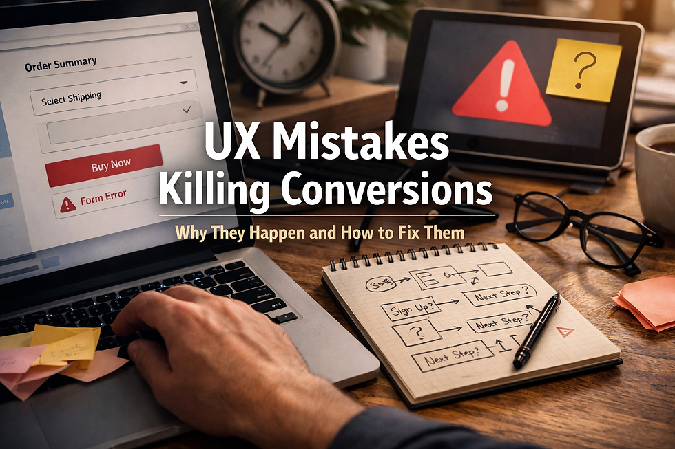
When conversion rates drop, most teams blame traffic, messaging, or design.
But in many cases, the real problem sits in the UX—specifically, in how much effort users need to make decisions. Good UX reduces thinking.
Bad UX introduces hesitation. And hesitation is where conversions die.
Why UX kills conversions
Users don’t convert because they’re convinced. They convert because the path forward feels obvious. UX mistakes increase cognitive load at the worst possible moments: when users are ready to act.
Examples to develop:
Too many CTAs competing for attention
Navigation that doesn’t reflect user intent
Forms asking for information too early
Copy that explains instead of guiding action
Why these mistakes go unnoticed
UX problems rarely show up as “errors” in analytics. There’s no broken button—just users who hesitate, scroll, or leave. That’s why teams often respond with redesigns or more traffic, instead of fixing the friction already there.
Fixing UX without redesigning everything
Focus on:
Clarifying primary actions
Reducing choices per screen
Aligning content hierarchy with user intent
Removing unnecessary steps before conversion
Small changes, disproportionate impact.
Expert Insight
Conversion optimization isn’t about persuasion—it’s about removing doubt. The best UX doesn’t convince users to act; it makes the next step feel inevitable.
Key Takeaways
UX failures are friction failures
Cognitive load kills momentum
Redesigns don’t fix decision problems
Small UX fixes often outperform big visual changes
Before increasing traffic, remove friction. See how we identify UX issues that cost revenue


